3.4 Data Visualization
R is absolutely brilliant when it comes to data visualization, and this section will only scratch the surface. We will go over some basic data visualizations using the built-in features of R. There are a lot of resources out there that covers a separate R package called ggplot. It’s a handy package, but knowing the features discussed here will be sufficient for our course as well as give you some background that will help you push ggplot farther (if need be).
3.4.1 Histograms
A histogram breaks data observations into bins (or breaks) and shows the frequency distribution of these bins. We will use this to consider probability distributions, but it also helps us get an idea of the distributional properties of any data sample.
Let us continue to analyze the car dataset we created above:
hist(CARDATA$RSALES)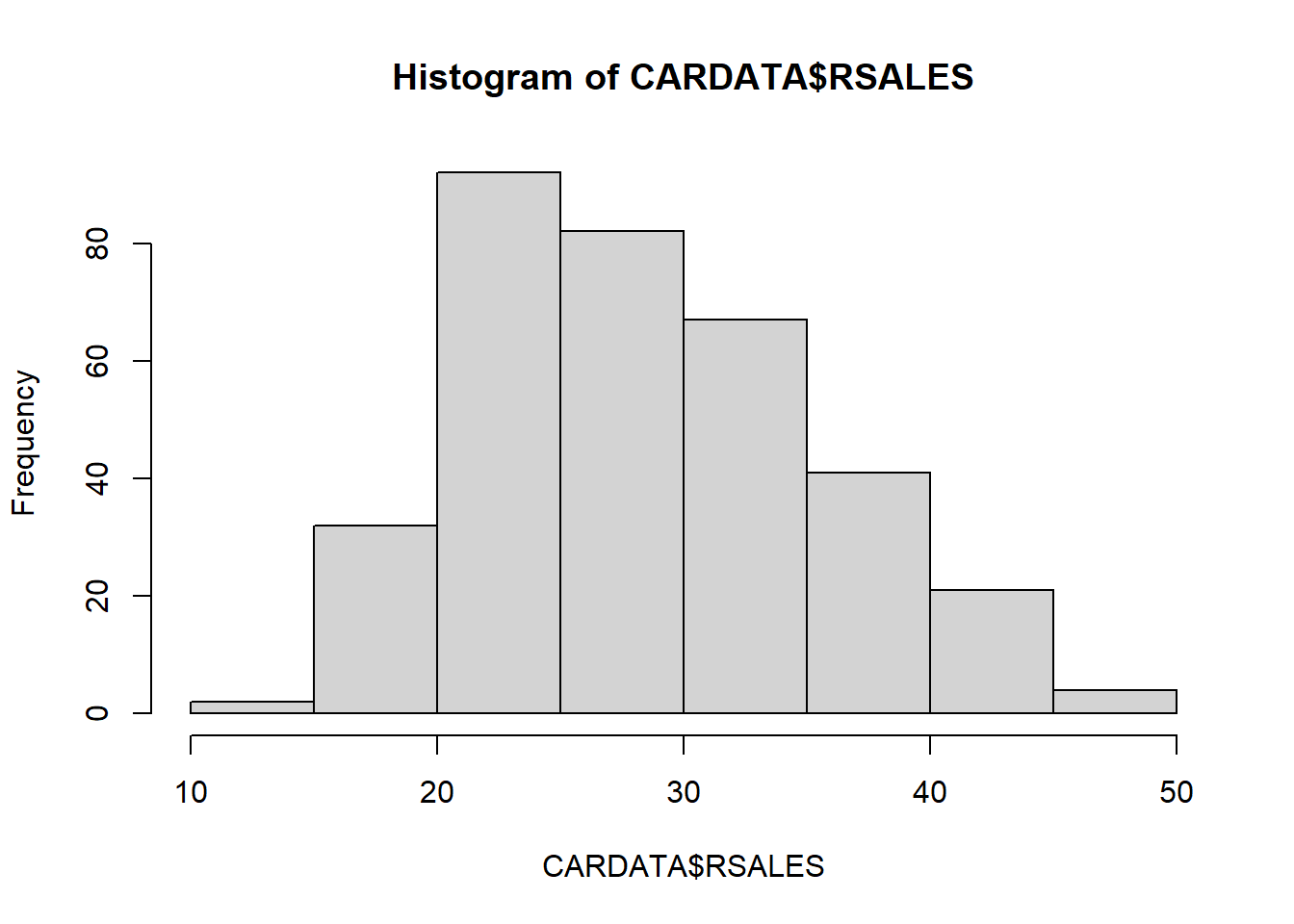
We can fancy this up by changing the title (main), labels (xlab), number of bins (breaks), and color (col). We will do this one at a time by creating a 2 by 2 set of figures using the par(mfrow=c(2,2)) command. This command partitions the plot window into a 2x2 series of subplots.
par(mfrow=c(2,2))
hist(CARDATA$RSALES,main = "Real Auto Sales")
hist(CARDATA$RSALES,main = "Real Auto Sales",
     xlab = "Real Sales")
hist(CARDATA$RSALES,main = "Real Auto Sales",
     xlab = "Real Sales",
     breaks = 40)
hist(CARDATA$RSALES,main = "Real Auto Sales",
     xlab = "Real Sales",
     breaks = 40,
     col = "pink")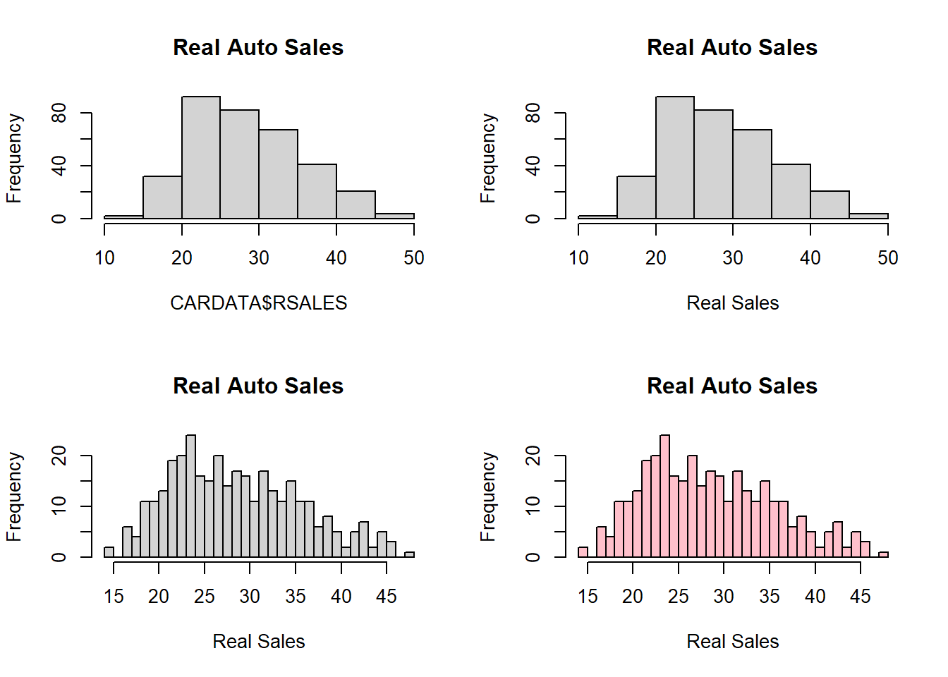
3.4.2 Line, bar, and Scatter Plots
The plot command can visualize the relationship between two variables or just one variable in order. The barplot command is similar to a single-variable plot.
We can look at the nominal sales data in a line plot by specifying the type of plot as “l”. A barplot delivers the same information, but just looks different.
par(mfrow=c(2,1))
plot(CARDATA$AUTOSALE, type = "l")
barplot(CARDATA$AUTOSALE)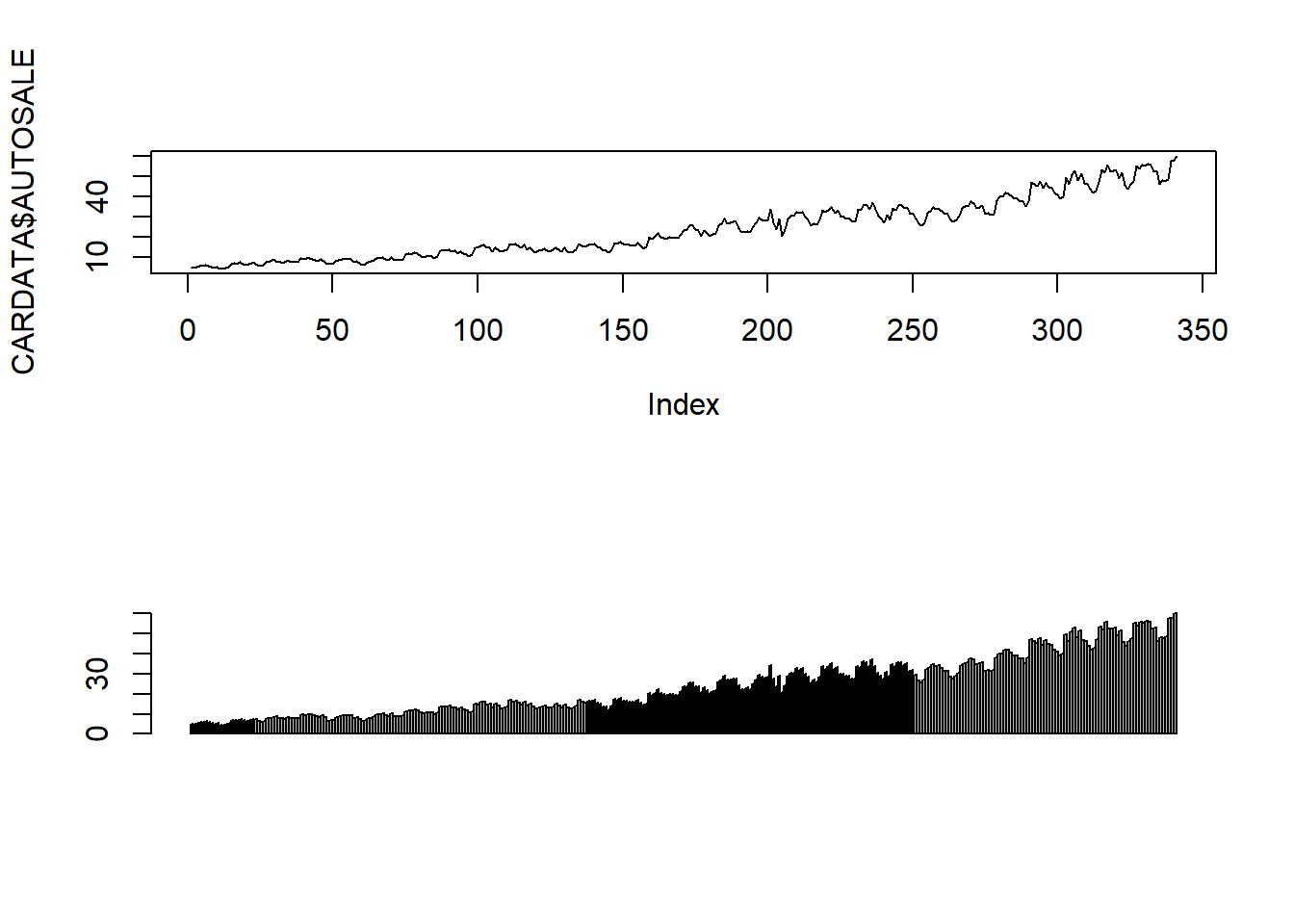
We can look at relationships using the default values of the plot command.
plot(CARDATA$CPI,CARDATA$AUTOSALE)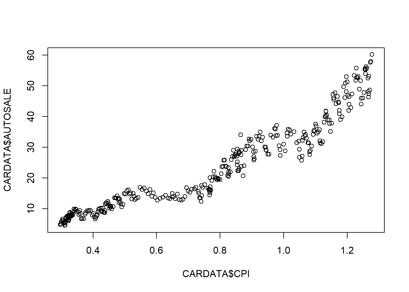
You will see plenty of these plots throughout these notes, and they will get increasingly more sophisticated with titles, colors, etc.
3.4.3 Boxplots
Box Plot illustrate the minimum, the 25th, 50th (median), 75th percentiles and the maximum. It is useful for visualizing the spread of the data.
boxplot(CARDATA$AUTOSALE)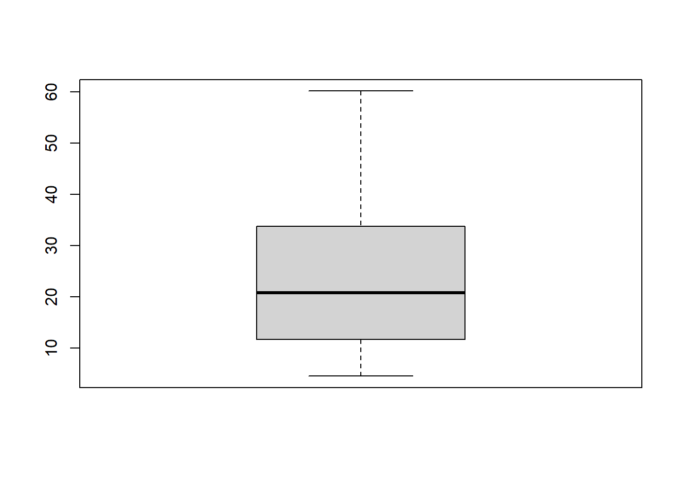
We can also examine these five numbers within groups according to some other variable. Lets look at this breakdown of auto sales per month of the year.
boxplot(CARDATA$AUTOSALE~CARDATA$MONTH)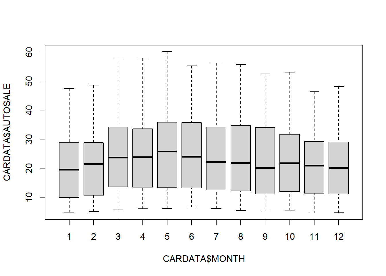
3.4.4 Much more out there
While this basically covers most of the plots we will need for the course, there is a ton more out there. The interested reader can consult a free book on the matter.
https://rkabacoff.github.io/datavis/
However deep you want to go, I hope you have seen that data visualization in R is a heck of a lot easier than in Excel.3
For example, a histogram in MS Excel takes about 20 minutes for me to create for each one!↩︎